One document, very different readers
A typical ESG report packs into a few dozen pages environmental indicators (CO₂ emissions, water consumption, waste), social data (diversity, training, workplace wellbeing), governance elements and objectives projected over 3 to 10 years.
These pieces of information are not addressed to the same reader. The financial analyst is looking for key figures at a glance. The journalist wants to understand the overall strategy. The employee is looking for the commitments that directly concern them.
Good editorial design creates an architecture that lets each reader navigate at their own reading level — without the document becoming an unreadable encyclopaedia.
A well-designed ESG report does not try to show everything. It decides what the reader should retain, and in what order.
Information hierarchy: the foundation
Visual hierarchy in an ESG report is built at several scales:
- At document level: a clear chapter structure with accessible summaries at the opening of each section
- At page level: a clear distinction between primary data and contextual data
- At figure level: key KPIs highlighted, technical data kept discreet
Without this hierarchy, the report becomes an exhaustive list that nobody reads in full, even if the data it contains is solid.
Data visualisation: turning figures into arguments
A 40-row table can be accurate. It will not be read. A well-constructed chart conveys the same information in a few seconds and stays in memory.
In an ESG publication, data visualisation serves several purposes:
- Comparison over time: showing how emissions evolved over five years
- Contextualisation: placing a figure relative to a target or a sector benchmark
- Synthesis: condensing a complex indicator into an instant read
The challenge is to choose the right format for each type of data, and to maintain visual consistency throughout the document, so the reader does not have to re-learn the visual code on every page.
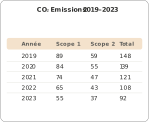
The table is accurate, but it demands active reading effort. The downward trend is not immediately visible.
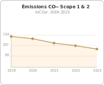
The same data as a chart: the downward trend is readable in one second. The reader retains the message without effort.
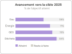
Progress bars let readers compare multiple indicators at a glance and visualise the remaining gap.
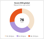
A donut score gives the time-pressed reader an instant read before they go deeper into the detail.
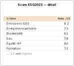
The detail table follows logically from the synthesis. Readers go deeper when they need to, at their own pace.
Typography and systemic consistency
A credible ESG report relies on a rigorous typographic system: defined styles for every text level (headings, subheadings, body, captions, key figures) applied without exception throughout the document.
Typography does not only serve aesthetics, it signals structure. A reader flicking through a report in 30 seconds should immediately identify what is a heading, what is a key figure, what is a footnote. Systemic consistency (colours, icons, chart formats) also builds the document's credibility.
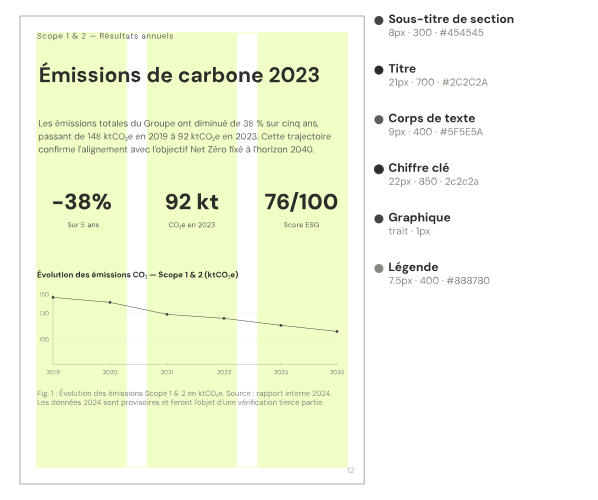
Each level has a precise role (size, weight, colour) applied without exception across the entire document. The reader learns the visual code only once.
A strategic issue, not just a formal one
Investors and regulators read dozens of ESG reports every year. The formal quality of a document is the first signal they perceive, even before reading the content. A clear, legible, visually consistent report communicates rigour and command.
Conversely, a dense and visually inconsistent document may raise doubts, not about the data itself, but about the organisation's ability to master it.
In a context where the CSRD is raising the bar year on year, the editorial design of an ESG report is no longer a detail. It is a strategic communication tool.